Step 3: Read and Interpret Information on the Diagrams
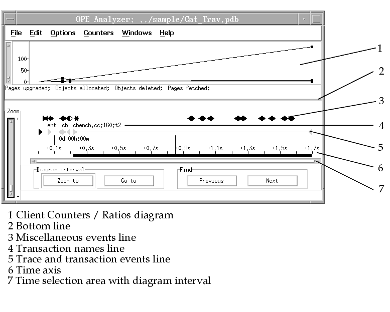
After the formatting step finishes, the TimeLine diagram with selected Client Counters diagrams and the ElapsedTime diagram are displayed. $OS_OPE_ROOTDIR/sample/Cat_Trav.pdb is used as an example for the diagrams.
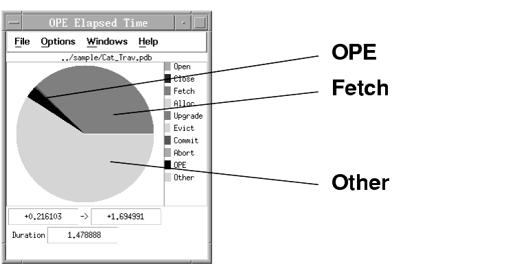
First, look at the ElapsedTime diagram. It gives you an overview of how much time processing categories of events and operations takes.
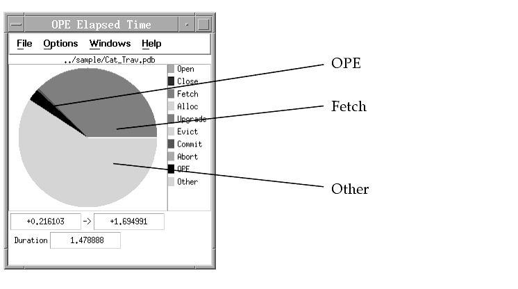
Reading diagram contents
This ElapsedTime diagram tells you the following:
- Other processing takes a small amount of the overall elapsed time.
- OPE processing takes a small amount of the overall elapsed time, and does not influence other processing categories.
- Categories representing ObjectStore-related activities, such as fetch, upgrade, and eviction, take more than half of the overall elapsed time.
Interpreting diagram contents
- For fetch: ineffective data clustering or an incorrect fetch policy
- For upgrade: ineffective use of persistent data locking
- For eviction: ineffective data clustering or a cache size that is too small
Conclusion
Summarizing the information on the ElapsedTime diagram, there might be an ObjectStore-related performance problem. Look at the TimeLine diagram to get an overview of the trace data. The overview of counters, events, and transactions gives you hints and tips where possible performance problems are located. From the peaks you can determine transactions that show a lot of activity.
Getting more information
By default, the TimeLine shows you generic events, trace and transaction events, and exception events on the event lines. When you take a closer look at the trace and transaction event lines, you see
- Modes in which the application uses transactions
- Nesting structure of the transactions
- Duration of the transactions
- Duration of the commit processing
The transaction labels are indicated in the status line depending on the position of your mouse pointer. For example, when you place your mouse pointer on an event in the trace and transaction events line, the status line shows you event type, event time, and the corresponding transaction name.
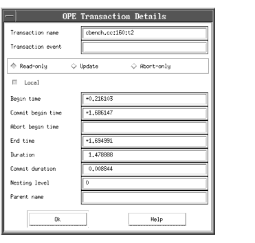
Pop-up menus for start and end events of the transactions give you detailed information on each transaction. For example, click on a transaction event with the right mouse button and select Show Details. This shows you the Transaction Details dialog with detailed information on the selected transaction:
Examining a single transaction
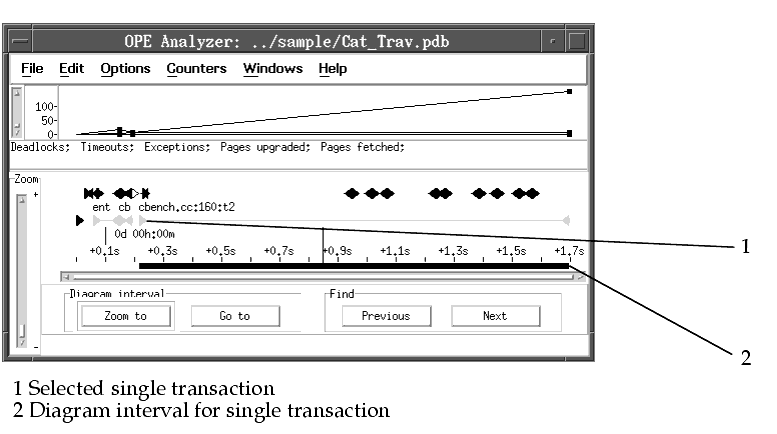
To take a closer look at a single transaction, define the transaction as the diagram interval. To define a single transaction as the diagram interval, move the mouse pointer on the transaction and click on it with the left mouse button. The diagram interval and the ElapsedTime diagram change accordingly. The diagram interval represents the time interval for which the information on the PageState diagram, the ElapsedTime diagram, and the Storage Counters/Ratios diagram is valid.
You can define any other diagram interval by moving the mouse pointer to any start point on the time selection area, pressing and holding down the left mouse button, moving the mouse pointer to the right, and releasing the left mouse button at the end point.
The ElapsedTime diagram changes accordingly, displaying the new categories to represent the new diagram interval.
The following figure shows you the TimeLine diagram and the ElapsedTime diagram for a single transaction:
Viewing more details
For more details, select Zoom to; the diagram interval representing this transaction fills the whole time line.
Displaying more events
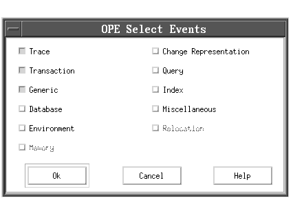
By default, OPE shows you only a selected number of events. Use Select events from the Options menu to choose other events that you want to display on the TimeLine diagram.
Looking at client counters
You should also look at the client counters that are shown in the Client Counters/Ratios diagram area. They give you statistical information on ObjectStore's persistent data handling for all databases to which your application has access during its run. Note that you can change the size of the diagram by dragging the bottom line of the diagram pane. When you open the Client Counters/Ratios diagram for the first time, OPE displays several counters by default.
Reading and interpreting diagram contents
Check, for example, the numbers of
- Deadlocks, timeouts, and callbacks, to see whether your application encounters problems due to concurrent data access
- Page fetches, to get an idea whether the data clustering is appropriate
- Page upgrades, because a high number can indicate an inappropriate lock policy
- Evictions, because a high number indicates a cache size that is too small for persistent data handling
The points of measurement are joined by thin lines. Thus, you can see how a counter changes from transaction to transaction. When you move your mouse pointer on these lines, the status line shows you the name of the counter or ratio that is next to the mouse pointer. Note that the lines do not reflect a change over time.
Displaying more counters or creating a new diagram
To display additional counters, invoke the pop-up menu by clicking the right mouse button in the diagram area and selecting Modify graph.
If this graph contains too much measurement data, you can create a new diagram. To do this, select New client counter graph from the Counters menu. It offers you a selection of new graphs.
Conclusion
Assume that you identify a counter indicating a possible performance problem; for example, there are too many page fetches. You know the transaction in which the problem occurs but you do not know the associated section of the persistent memory. To answer this question, look at the Storage Counters/Ratios diagram.
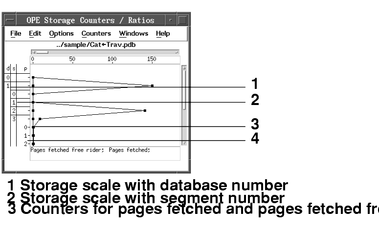
It shows you the same type of counters as the Client Counters/Ratios diagram. Additionally, it shows you to which database, segment, cluster, or page the counter belongs.
Displaying the Storage Counters/Ratios diagram
Make sure that the diagram interval is valid for the transaction that you want to examine. You can check this on the TimeLine diagram. Then, select Storage counters from the Windows menu to display the following diagram:
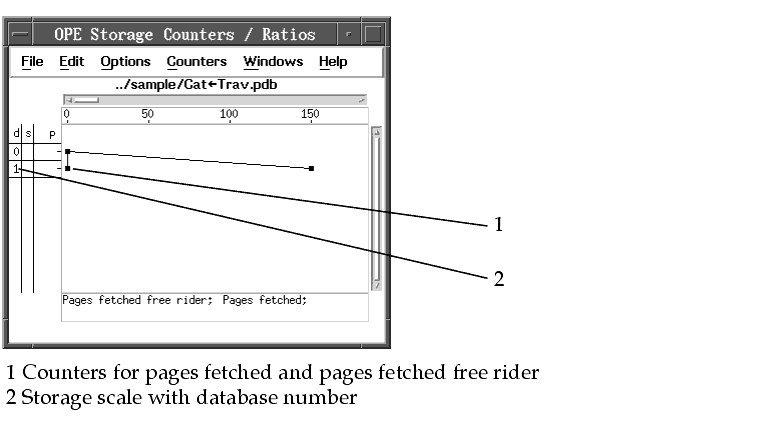
Note: The figure above stems from an OPE Rel1.5 sample and does not show clusters.
The sample diagram shows you the counters for pages fetched and pages fetched free rider of the databases to which your application has access during tracing. It also shows you the number of the database in the left column of the storage scale. When you place the mouse pointer on this number, the status line shows you the name of the database.
Displaying the counters for segments
To see the same counters for segments located in the database, double-click on the database number in the storage scale. Now, the diagram also shows you the counters for the segments:
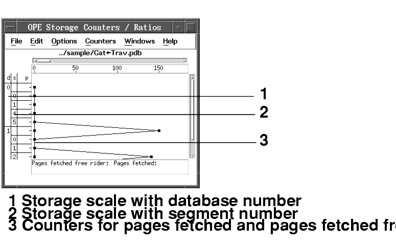
Note: The figure above stems from an OPE Rel1.5 sample and does not show clusters.
Displaying the counters for clusters
To see the same counters for clusters located in the segment, double-click on the segment number in the storage scale. Now, the diagram also shows you the counters for the clusters.
Displaying the counters for pages
To see the same counters for pages corresponding to the cluster, double-click on the segment number in the storage scale. Now, the diagram also shows you the counters for the pages:
Note: The figure above stems from an OPE Rel1.5 sample and does not show clusters.
Use the pop-up menu to change the graph displayed, or select Counters from the menu bar to create a new graph.
The most detailed view of the application trace, however, is provided by the PageState diagram. It is based on different storage levels and informs you about paging and locking events on database, segment, or page level. For each storage object, you see how its state changes and which events occur.
Displaying the PageState diagram
To display this diagram, select PageState diagram from the Windows menu. The information on the diagram is valid for the selected diagram interval:
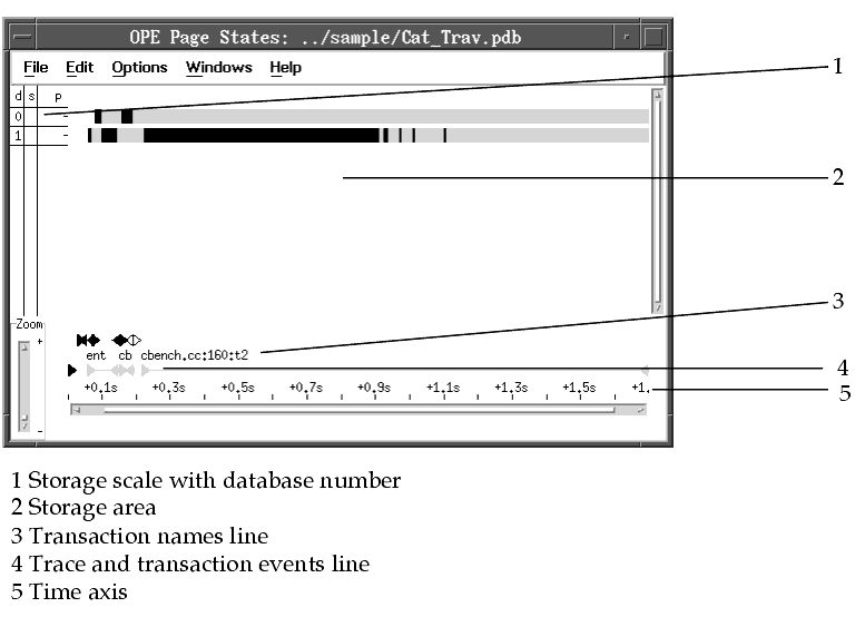
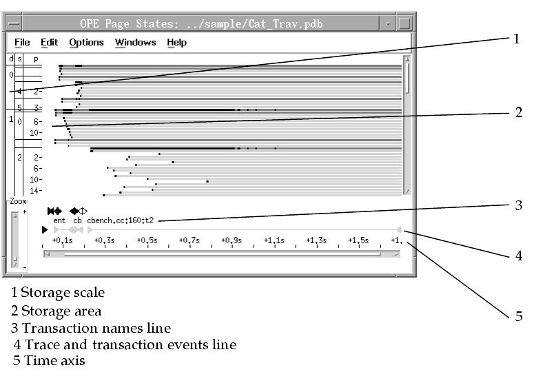
On the PageState diagram, you can view information about page and lock events on database, segment, cluster, or page level. When you double-click on a bar representing a database, you see the segments contained in the database. When you double-click on a bar representing a segment, you see the clusters contained in the segment. When you double-click on a bar representing a cluster, you see the pages contained in the segment. The page level is the deepest level. You can also get rid of information that you are not interested in by hiding inactive storage objects. To do this, select Hide inactive storage objects from the pop-up menu or from the Edit menu.
The following example shows you the PageState diagram at page level. Note that the bar size is changed to small. To do this, select Bar size from the Options menu.
Reading diagram contents
Starting from the page level, you see that the state of a page changes gradually. You can deduce the following information from the diagram:
- Time at which the page is fetched from the Server
- Lock state upgrades and wait times to get the locks
- Events that occur on individual pages
- Duration of the page fetch
- Encached state and lock state of the page after the fetch
Additionally, you can count the number of
- Pages of a cluster that are fetched one after another
- Pages fetched for read (ERLR)
- Pages upgraded for update (EWLW)
Interpreting diagram contents
A high number of pages of a cluster that are fetched one after another indicates that you should change the fetch policy and fetch the complete cluster within a single fetch process.
A high number of pages that are fetched for read and later upgraded for update indicates that you should change your lock policy.
Summary
OPE presents controls and modes that allow you to measure performance of your application. OPE also lets you analyze performance measurements and interpret the results to modify the application program.
OPE offers two other features in addition to the diagrams:
- Transaction summary
- Generic events


